How Architects Can Specify the Right Metal Finish – Part 2
Painted Metal is an amazing product – its finish offers unmatched durability, flexibility, and color vibrancy to suit any project’s needs. However, in today’s market, product specifiers are swamped with a vast array of color and finish options. Contrasting terminology amongst manufacturers, differing warranty provisions, and varying levels of manufacturer sophistication, contribute to the complexity in the finish selection process. Inappropriate finish selection, digital representation limitations, and improper field installation practices can also translate to design visions mismatching with end solution reality. To help demystify the different elements of a painted metal finish, to encourage specifiers to select an appropriate color and finish, and to ensure design vision is translated into reality, Steelscape has created this four-part series on specifying a painted metal finish. Overall, we hope this summary provides architects with the tools needed to feel more comfortable and confident when specifying metal roofing and metal siding in their designs.
Selecting the Right Color – Part 2
A key advantage of pre-painted metal is the wide variety of color and finish options available. A popular element of metal is how effectively it can evoke appeal through full, vivid colors. The beauty of metal is that it can be coated in almost any solid color to fulfill a design vision. From the darkest of blacks to the most vibrant reds and everything in between. Metal is often the product of choice for wall highlights, roof surfaces and accent pieces, as its smooth surface and high gloss provides color vibrancy unmatched by other material types. Modern metal palettes have also evolved in recent years to focus on versatile bronzes, grays and neutral tones, for enhanced versatility and integration with other materials. In fact, Dark Bronze emerged as the most popular color among leading roof and wall product manufacturers in 2019. Vibrant colors such as bright reds and blues continue to be used in accent pieces in addition to the application of the timeless colors of silvers and champagnes throughout building design. Emerging trends have seen the resurgence of black as both a roof and siding color, particularly in matte, duller finishes. We see this appeal for matte finishes extending to grays, whites, and bronzes in the foreseeable future.
Despite these trends, there is no right or wrong metal color – it all depends on the design vision. For example, in the Portland Place apartments in Chico California (pictured below), two uncommon, contrasting colors are used together – Steelscape’s Classic Red and Relentless Olive. These colors work effectively with the texture of a corrugated panel to provide distinctive visual appeal to this multifamily complex.
Project Spotlight
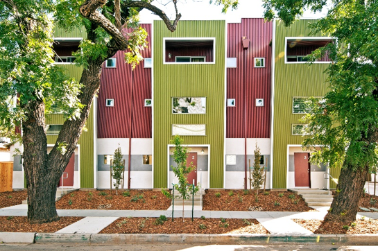
Portland Place Apartments, Chico CA
Of note, bright colors contain organic pigments which may see these colors fade at a faster rate compared to duller colors consisting of inorganic pigments which are engineered to retain their color longer. In some applications, a clear coat is applied to protect these vibrant hues from color fade over an extended period.
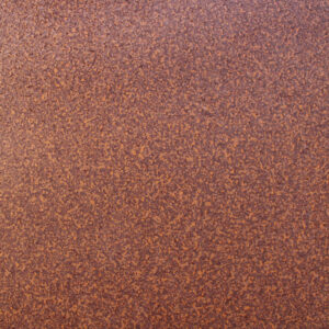
Designers and specifications may seek to add additional depth to standard colors to engage building users. Key color options include micas, tints, and specialty print designs. Micas are specially formulated pigments that are added to standard paints to create a sparkling or light catching effect. Individual mica pigment particles are flat in nature allowing for light to reflect at various angles. This creates additional depth and a more dynamic interaction with natural light which will vary and shimmer from different angles. Common micas include silver, bronze, champagne and copper tones. However, micas, such as golds and silvers can be mixed with contrasting solid colors such as blacks and magentas to create distinctive colors. Micas are commonly called metallics, as the application of metal flake was traditionally the common method for creating these colors. Due to the superior consistency of micas, metallic pigments are rarely used in modern paint systems. Despite this, mica pigments are still directional in nature and may vary slightly from batch to batch. This means that designers and installers must take care in ensuring product is sourced from a singular provider at one point in time, to avoid mixing product which can impact the installed appearance.
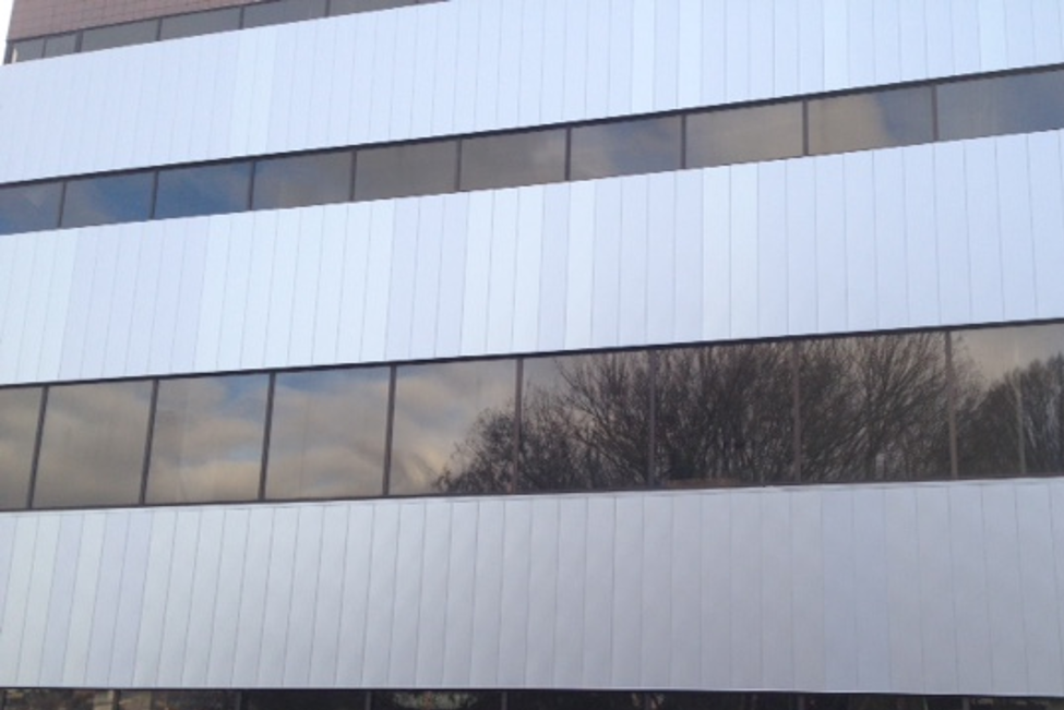
Slight color variance in a metallic silver finish due to micas sourced from different batches
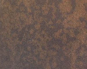
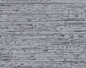
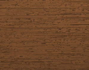
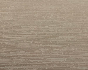
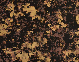
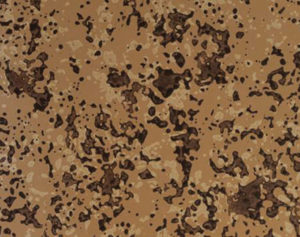
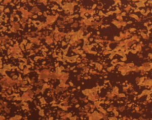
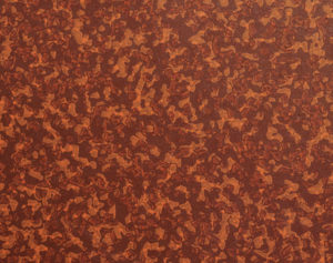
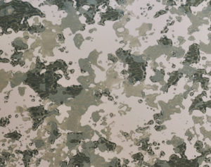
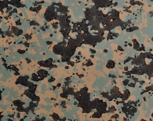
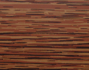
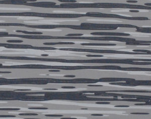
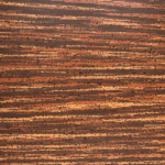
Tints and resins such as Steelscape’s Eternal Collection®, use the combination of a translucent paint and a primer-less base to create depth. A distinctive finish is created as the base metal is somewhat transparent with a visually deep coating applied over the top to provide a unique interaction with light. Additional texture, depth or realism can also be imparted onto metal through a printed design. In this approach multiple layers of paint are applied to the metal in a certain pattern to create distinctive new looks or to replicate the emotive appeal of other finishes such as wood and stone. Considerations when selecting this type of finish include how it will be viewed from afar and the impact of repeating patterns. As these patterns are applied using a roll with a fixed diameter, large discernible items will create a repetitive pattern. As a result, these designs often avoid featuring prominent pattern elements to create an authentic, desirable finish that integrates with the rest of the building.
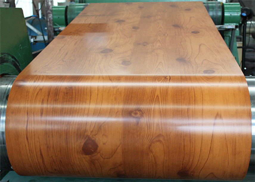
Notice how the wood knots in this laminated design creates a noticeable repeating pattern not visible in authentic wood products.
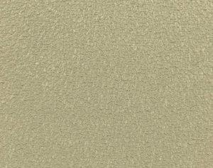
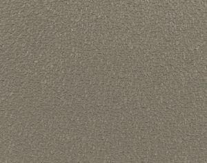
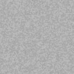
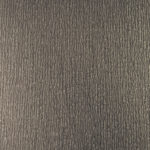
A key metric to gauge how a color will appear once installed is Light Reflective Value (LRV). LRV measures the amount of visible or usable light that reflects from a surface. LRV is expressed as a percentage from 0 to 100; the higher the number the more visible light that is reflected. Typically, lighter colors will have a higher value than dark colors, but texture can impact LRV as well. Rough textures tend to reflect less visible light as the light hits the surface at varied angels. Gloss and sheen are two other terms used to describe visible reflection of a surface. Gloss is the measurement of visible light at a 60° angle from the surface, while sheen is measured at 85°. High gloss/sheen results in high glare or shine from a surface, while low gloss/sheen surfaces have a flat or matte appearance. Glare, often a concern with metal roofs, is controlled by lowering the sheen value. Examples of paint systems used to reduce the sheen on a roof include matte paint systems or those with a physical texture such as Steelscape’s Rawhide product. Textured products will use a crinkle paint technology that imparts texture during the curing process to create a non-uniform texture that can dissipate light.
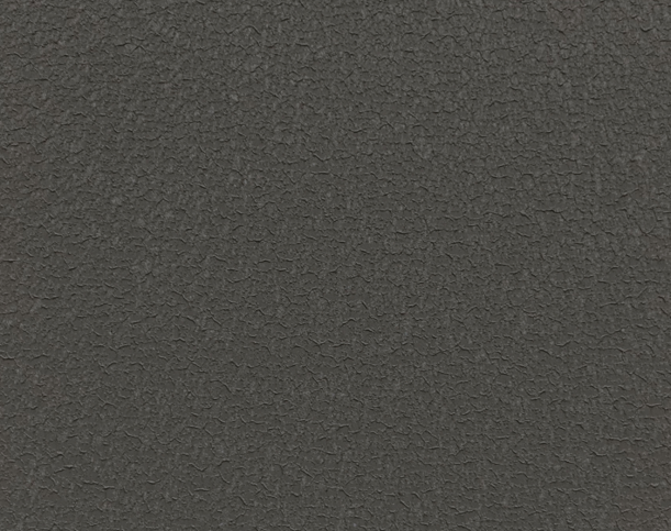
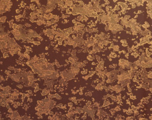
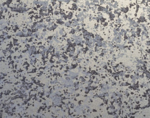
A textured painted metal system up close
Another key color consideration is the Solar Reflectance Index (SRI) of a finish. The SRI is a value created from solar reflectance and emissivity with factors such as air flow considered. Solar reflectance is the amount of solar radiation reflected off a surface and emissivity is the amount of heat a surface can dissipate away from itself. Solar radiation that creates heat stems from Near-Infrared Light (NIR) wavelengths, which are not visible to the human eye. Reflecting NIR wavelengths means that heat is reflected from the surface, significantly improving structure energy efficiency by reducing cooling costs. According to the Lawrence Berkeley National Laboratory, for every 10% increase in roof reflectance, cooling costs drop 2 cents per square foot per year. Colors with a higher SRI value will dissipate heat more effectively. Some metal finishes use “Cool” pigment technology, which are pigments that have been altered chemically and physically to reflect Near-Infrared (NIR) wavelengths. These coatings will have significantly higher SRI values compared to traditional paint colors. Lighter colors also offer superior reflective properties compared to dark colors and will have higher SRI values.
For more information on other current color trends, complementary palettes and other color considerations, see the Steelscape Color Design Guide and Single Skin Metal Wall Design Guide. In the next part we will discuss how to specify the right paint system based on the installed environment.
If you have any questions not answered in this four-part series, please feel free to contact Steelscape directly at (888) 553-5521 or “Ask Steelscape” via Steelscape.com.
This concludes our Selecting the Right Color, the second article in our four-part series on How Architects Can Specify the Right Metal Finish. To learn more about the core constructs of a pre-painted metal finish, see the paint and metal 101 documents at www.steelscape.com/resources/document-library or visit the Architect Center. Look for our next article where we will discuss specifying the right paint system based on the installed environment.
Request your samples and product literature today!
Did you find this article helpful?

